IRC Meeting 4, Kerning and Dave's 3 Key Widgets
2016-05-12
Today all 4 of us - Dave, Eli, Harshita, and Yash - met on IRC, and the log is at http://meeting.sugarlabs.org/sugar-meeting/2016-05-11
I confirmed on the mailing list that we’ll be working with Python 2.7, and I’m pretty sure that defcon and all the other core libraries are compatible with Python 2.7. So the the main work ahead is in making something like defconAppkit or defconQt, something to connect defcon’s abstract python class/objects to UI widgets.
Eli has followed some PyGTK tutorials, and shared this “hello world” screenshot ;)
The discussion had a couple of main topics that I wanted to highlight for the blog…
Kerning
Yash’s main question was about kerning. I noted how kerning is kept in the UFO in 2 places, the kerning.plist and the features.fea files; I think the latter is out of scope until after the mid way evaluation, and the former is out of scope for round 1 at least :) So no need to think about this just yet :) For me, kerning is not that important… My cantarell original and verdana and georgia from MS dont have any!
Kerning is made during the final production stages of font development project. You can see this in this diagram of the overall font development process:
Perhaps the AV needs to be kerned, but its not a high priority feature at all; our default glyph set could just be uppercase, numbers, and the most basic punctuation. Then we could provide templates to easily extend the glyph set with a lowercase, or sets of accents based on specific languages, and present that for ‘advanced’ users :)
Analysis of My First Mock
The mockup I made has 3 core widgets:

I expect their implementation simplicity to be prioritised as follows:
- glyph picker
- text preview
- drawing canvas
1. Glyph Picker
The first thing is about working with a font object’s glyph children. Perhaps the most simple thing is to get the glyph objects’ attributes and popular a standard GTK table widget with them (eg, render their glyphname, a checkmark to indicate if glyph drawing data is present, their unicode value if they have one, freeform comments, etc) Then after getting these values, the next step would be setting them, both adding and removing glyphs themselves as well as all these attributes; and the combination of getting and setting via Sugar’s copy and paste mechanism to transfer the contents of one glyph to another glyph. A stretch goal is then to draw the glyph outlines into little canvas boxes as table cells, for previewing what the glyphs look like.
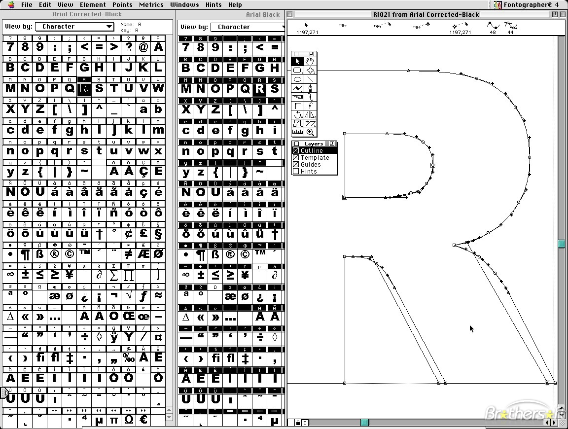
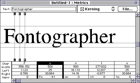
The classic “glyphs in a grid” view from Fontographer in the 80s (left side):
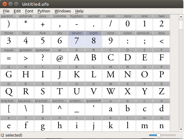
TruFont’s “glyph grid” from Yash’s proposal:
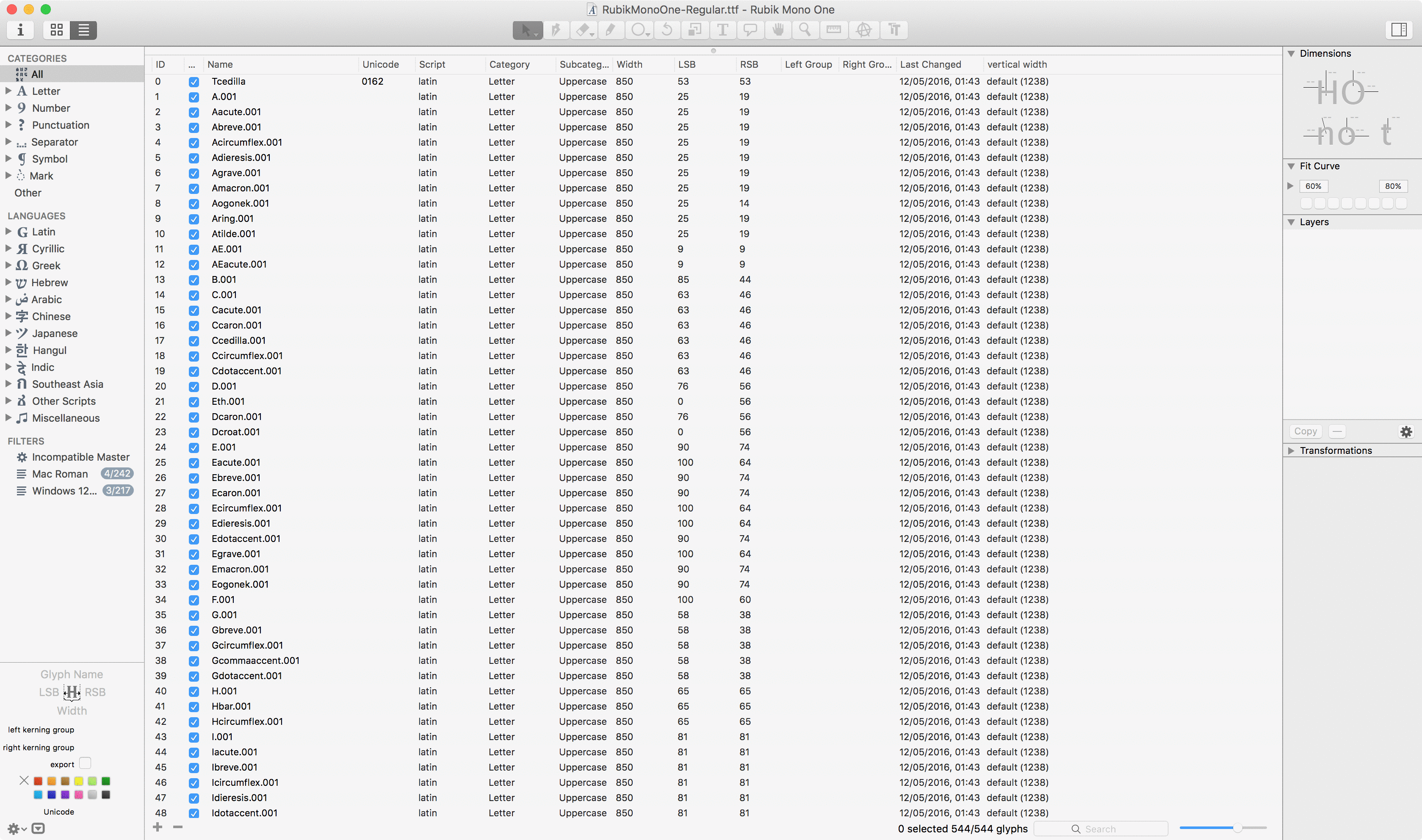
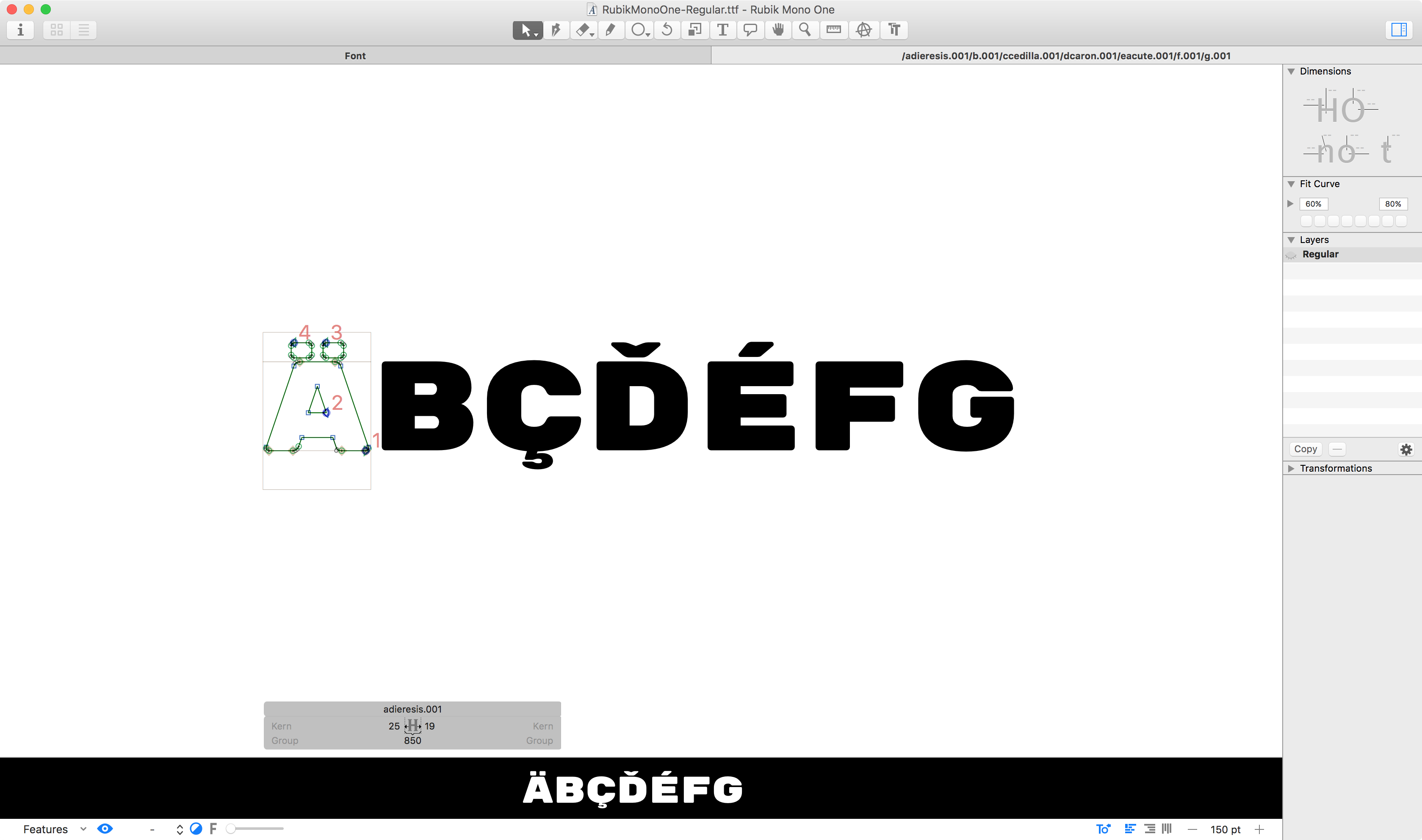
Glyphs App breaks from this tradition with a glyph table:
I think a table view of the glyphs is very useful even without a visual preview of the glyph. I suggest that as our first editor milestone.
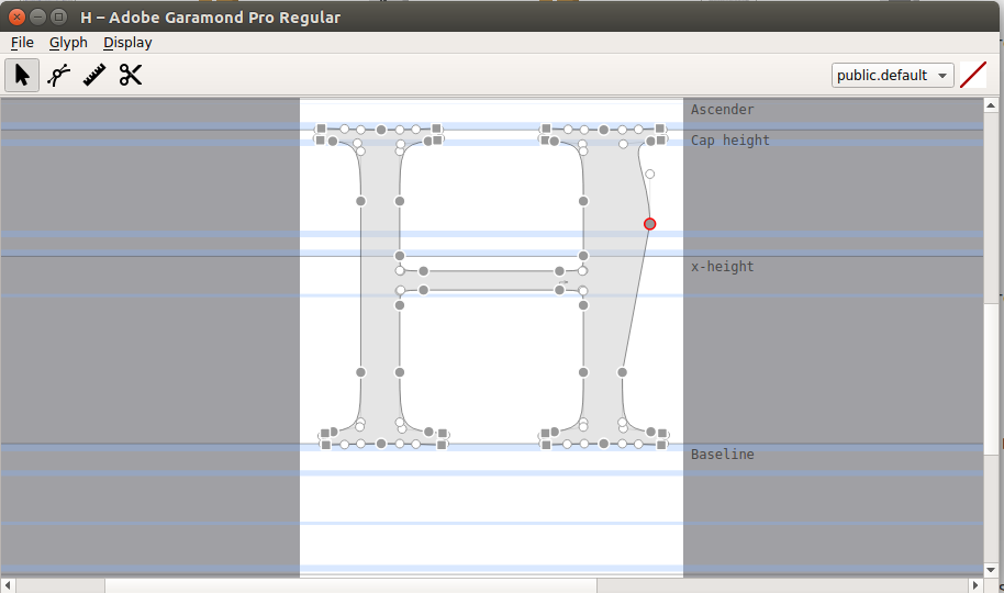
2. Drawing Canvas
This is the core of the application, and the most complex part. It is all about drawing the glyph outlines into little semi-visible canvas boxes, and then drawing editing widgets on and around them for moving points, moving guides, setting guides, add/removing points, etc.
The classic drawing canvas of Fontographer in the 80s (right side):
TruFont’s “drawing canvas” from Yash’s proposal:
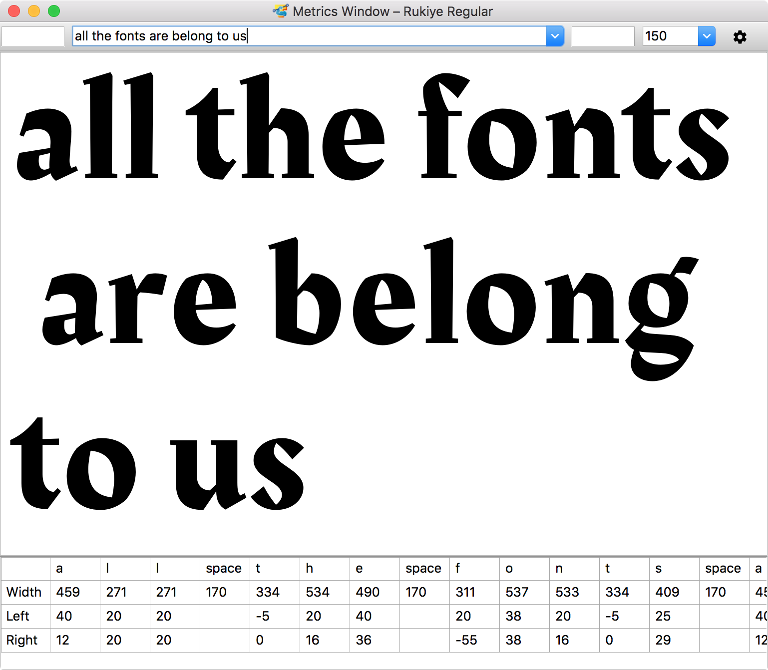
3. Text Preview
This is about drawing the glyphs outlines into little canvas boxes, sort of like the preview’d glyph picker, but with a twist that it is with invisible boxes, that create an illustion of text. Fontographer began the tradition of doing this in a “metrics window”, and TruFont has the same, where there is additionally a standard table widget underneath the live preview area, showing the numerical glyph width and sidebearing values:
Mark Simonson’s famous mock-up broke from this separation of drawing window and metrics window, and integrated them. This has been popularized in Glyphs App and is also already available in FontForge.
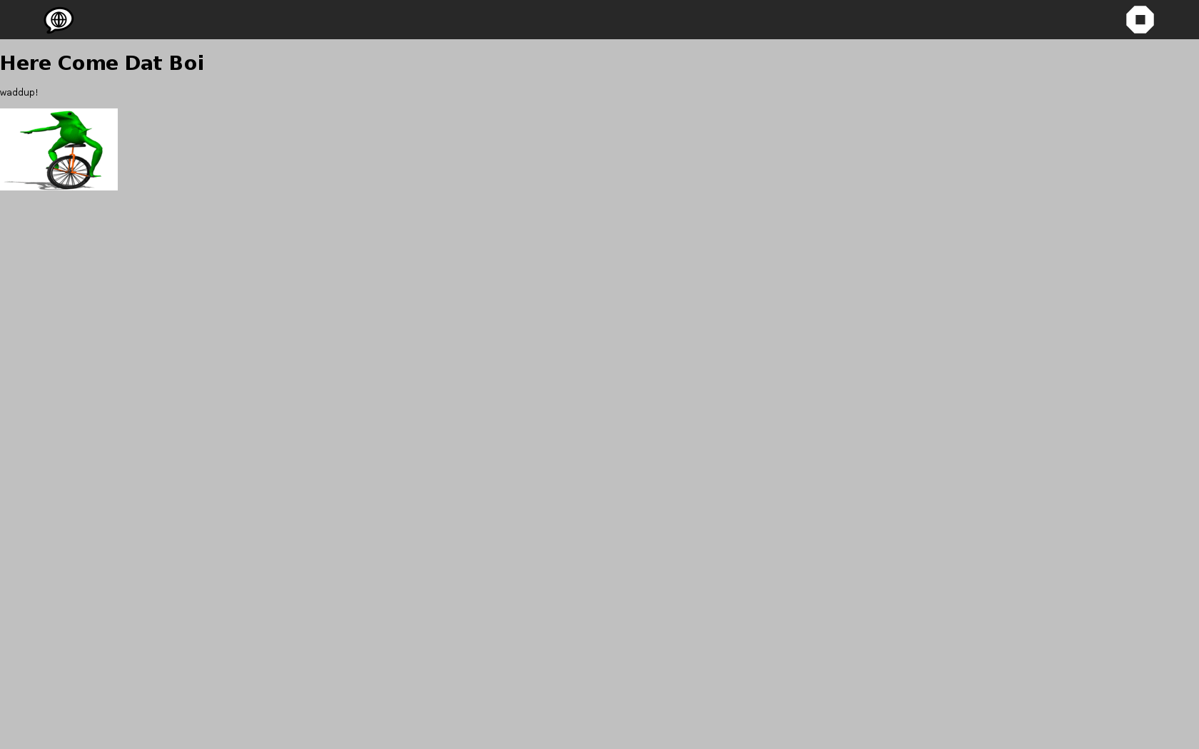
However, it is very useful to see a small-size preview of the glyphs in black on white (or white or black, or other colors :) as they are being drawn. A traditional WIMP desktop with overlapping windows (and multiple drawing and metrics windows) can be quickly and simply arranged in such a setup, but Sugar is not such a desktop! This makes the GlyphsApp feature of a Text Preview pane at the bottom relevant (in the below screenshot it is set in black-on-white :)
Conclusion
To conclude, no matter what the final UX design is, these 3 widget are completely essential to any font editor, so we must plan to develop them in some way. My recommendation today is to work on a glyph picker, then a ‘live’ text preview, and then the drawing part.