Screenshots of other Activities
2016-05-10
Here are a selection of screenshots from a selection of Sugar Activities worth considering when brainstorming the Edit Fonts UX:
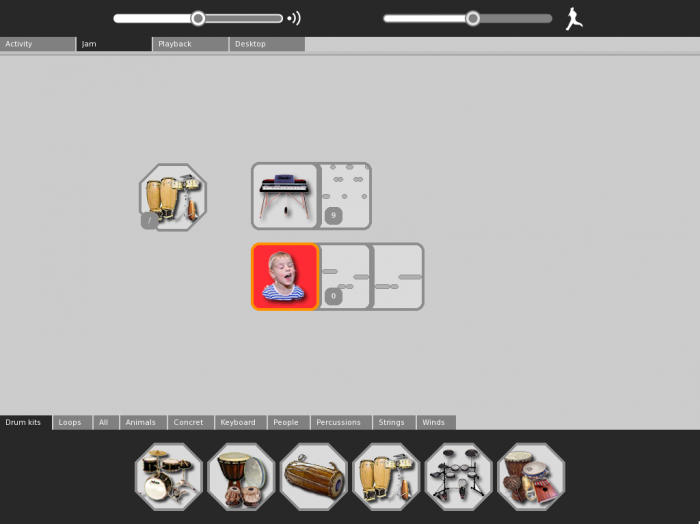
- primary toolbar is tabbed
- current primary toolbar has slider widgets, not just mode buttons
- bottom edge panel with tabs
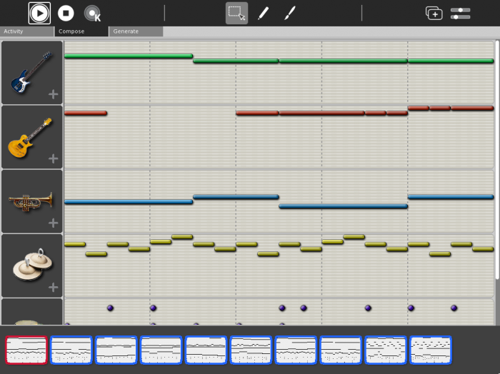
- primary toolbar is tabbed
- current primary toolbar has 3 sections
- left side secondary toolbar
- bottom edge timeline panel
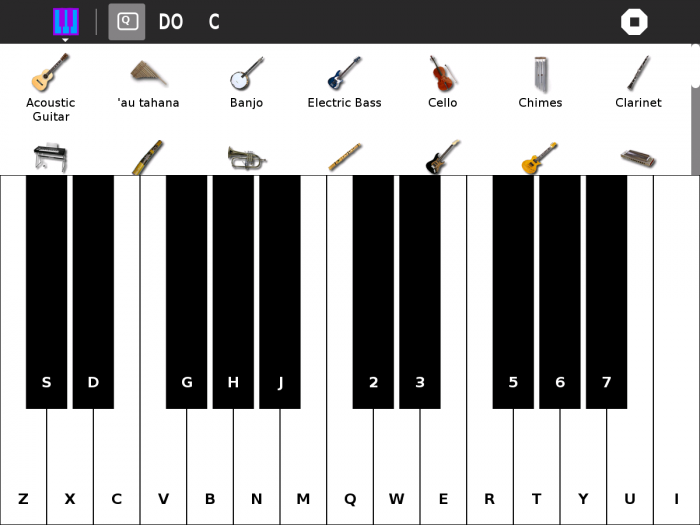
- primary toolbar is NOT tabbed
- top edge panel
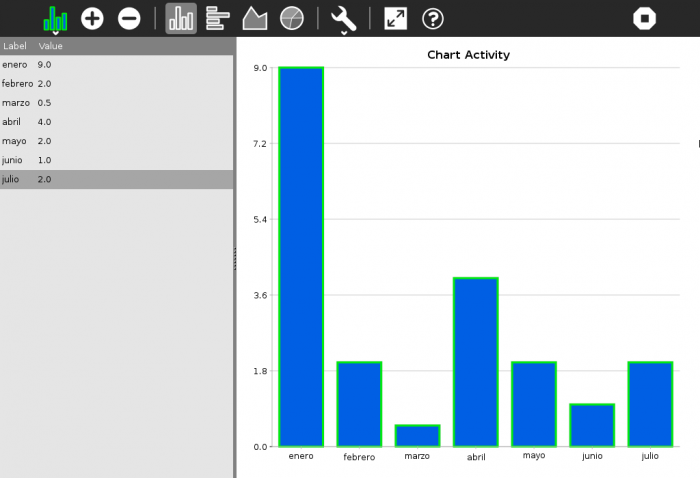
- left side panel
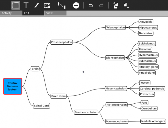
- primary toolbar is tabbed
- no other controls
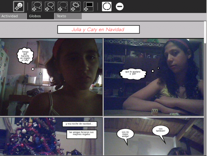
- primary toolbar is tabbed
- current primary tab has interesting “+” icons
- no other controls
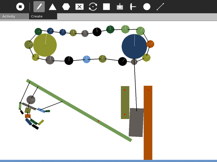
- primary toolbar is tabbed
- no other controls, super simple mode tools
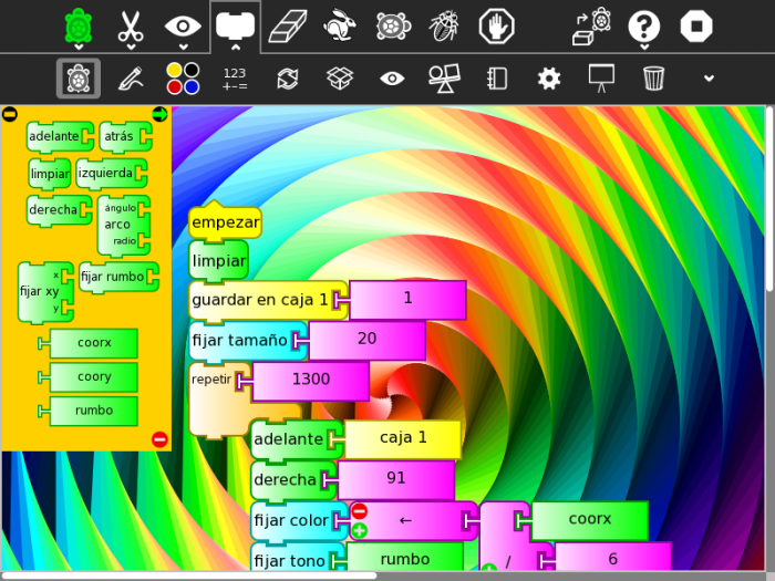
- primary toolbar is NOT tabbed
- very full set of primary and secondary mode buttons
- note the dropdown at the end of the secondary toolbar
- floating (?) left side panel, with minus and right-arrow circle buttons
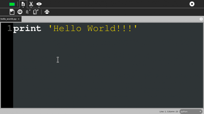
- primary toolbar is NOT tabbed - the application has tabs for its documents. Perhaps better to have this tab bar at the bottom of the canvas, to avoid confusion with the Sugar HIG primary toolbar tabs?
- very slim set of primary and secondary mode buttons